PRIMARY LOGO
This logo is for use in web and print. It should always be noticeable and not obscured.
Color Palette
- PANTONE 2756 C RGB 21, 31, 109 HEX 151F6D CMYK 100, 98, 26, 18
- PANTONE 158 C RGB 232, 119, 34 HEX E87722 CMYK 5, 65, 100, 0
- PANTONE 292 C RGB 105, 179, 231 HEX 69B3EF CMYK 53, 17, 0, 0
COLOR USAGE
![]()
CLEAR SPACE & SIZE LIMIT
Your logo is important and represents your brand all on it’s own. For that reason, it should be kept apart from other content so as not to mask its importance. It should maintain clear space on all sides the height of the letters in SOLUTION.
The logo should always be recognizable and should not be printed smaller than 1/2 inch in height.
ACCEPTABLE COLOR OPTIONS
-

CMYK or Pantone Spot Colors forall print options
-

RGB for all Web or MS Office programs
-

Black for all one color options
-

Grayscale for all one color options allowing shading
-

When using light blue for an accent color
-

When using orange for an accent color
UNACCEPTABLE LOGO TREATMENTS
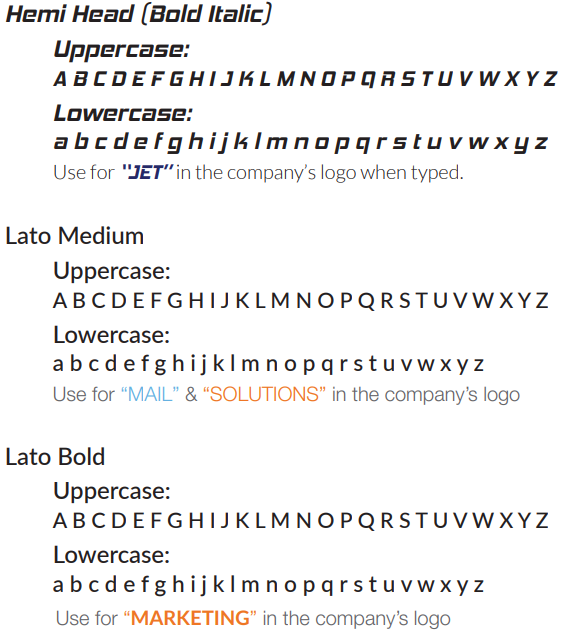
FONTS
- JET HEMIHEADRG-BOLDITALIC
- MAIL LATO MEDIUM
- MARKETING LATO HEAVY
- SOLUTIONS LATO MEDIUM
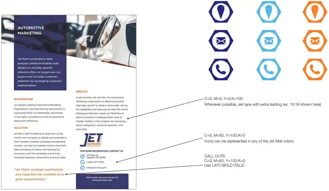
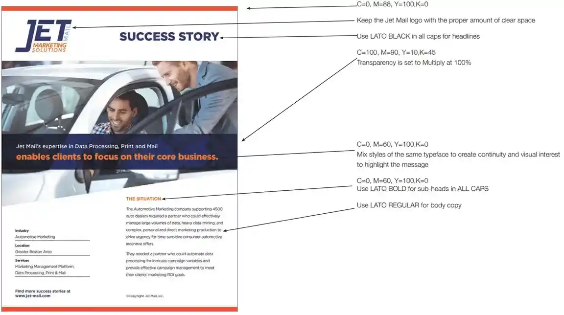
STYLIZING JET MAIL MARKETING SOLUTIONS COLLATERAL MATERIALS
EXAMPLES
All marketing collateral should have visual interest by utilizing color and imagery. This is accomplished by: overlaying color bars, enhancing typefaces, using photos/images that include colors of the Jet Mail brand, keeping 30%-50% white space and using angles to highlight pieces of importance.
STYLE
Use the dark orange bars to frame the top and bottom of the piece being created whenever possible.
EXAMPLES